The cryptocurrency market is known for its rapid movements and complex data sets. For individuals looking to visualize these changes beyond traditional red and green candle charts, Crypto Bubbles has emerged as a popular interactive tool. This platform provides a unique way to observe market dynamics, allowing users to see the “size” of price movements through an intuitive bubble-based interface.
In this review, we will explore the features, data sources, and practical applications of Crypto Bubbles. We will also examine how it compares to other market visualization tools and how it fits into the broader ecosystem of digital asset tracking.
Crypto Bubbles at a Glance
| Feature | Description |
| Primary Function | Interactive market visualization and price tracking |
| Supported Assets | Top 1000+ cryptocurrencies and tokens |
| Data Refresh Rate | Real-time / Near real-time |
| Platforms | Web browser, Android, and iOS |
| Cost | Free (with optional Pro features) |
| Customization | Extensive (Colors, sizes, timeframes, and metrics) |
What Is Crypto Bubbles?
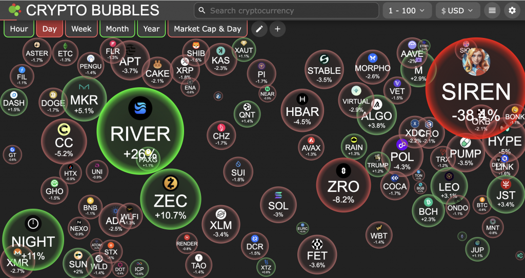
Crypto Bubbles is an interactive visualization tool designed to provide a bird’s-eye view of the cryptocurrency market. Instead of lists or spreadsheets, the platform represents each cryptocurrency as a circle (bubble). The size and color of these bubbles change based on market performance over a selected timeframe.
The platform serves as a “dashboard” for sentiment and movement. It is often utilized by participants to quickly identify which sectors of the market are experiencing significant upward or downward trends. By moving away from the “wall of text” typical of many exchanges, it aims to make market data more accessible and visually engaging for both new and experienced market participants.
How Crypto Bubbles Works
The mechanics of Crypto Bubbles are rooted in data aggregation. The platform pulls price, volume, and market capitalization data from various sources and translates that data into physical properties within the interface.
- Size Correlation: The size of a bubble typically represents the magnitude of a price change or the total market capitalization of the asset, depending on the user’s settings.
- Color Coding: Generally, green bubbles indicate a positive price movement, while red bubbles indicate a downward trend. The intensity of the color often correlates with the percentage of the change.
- Physics Engine: The bubbles move and “bounce” within the screen, creating a dynamic environment that updates as new data points are received from the underlying data providers.

Key Features of Crypto Bubbles
The utility of Crypto Bubbles extends beyond its aesthetic appeal. It offers several functional layers that allow for deep market analysis.
Interactive Bubble Visualization Chart
The core feature is the interactive chart. Users can click on any bubble to pull up a detailed sub-menu for that specific asset. This menu typically includes a mini-chart, current price, 24-hour volume, and market cap ranking. This interactivity allows for a streamlined transition from a macro view of the market to a micro view of an individual token.
Multi-Metric Tracking (Price, Market Cap, Volume)
Users are not limited to tracking price percentage changes. The interface can be toggled to display bubbles based on:
- Market Cap: Helping users visualize the dominance of major assets like Bitcoin or Ethereum relative to smaller altcoins.
- Volume: Identifying where the highest level of trading activity is occurring.
- Rank: Visualizing the hierarchy of assets within the top 100 or top 1000.
Advanced Filtering and Customization
The platform allows for significant personalization. Users can filter the view to only show specific categories, such as decentralized finance (DeFi) tokens, stablecoins, or assets within a specific exchange ecosystem. Furthermore, the “Edit” function allows users to change the content displayed inside the bubbles, such as showing the ticker symbol, the price, or the rank.
Crypto Bubbles Fees (Free vs. Pro Features)
For the vast majority of users, Crypto Bubbles is a free service. The web version and the basic mobile applications provide full access to the interactive charts and standard filtering tools.
However, there is often a “Pro” or “Premium” version available via mobile app stores. These paid tiers typically offer:
- Ad-Free Experience: Removing banner advertisements that may appear on the mobile interface.
- Extended Favorites: The ability to save a larger number of custom “Watchlist” bubbles.
- Advanced Customization: Additional color schemes or specialized physics settings for the bubble movements.
It is important to note that the core market data remains accessible to free users, ensuring that the platform remains a public resource for market transparency.
Security and Data Privacy
Because Crypto Bubbles is a visualization tool and not a custodial exchange or a wallet, the security considerations are different from those of a trading platform.
- Non-Custodial: The platform does not require users to deposit funds. It does not connect to your private keys or hold your digital assets.
- Data Sources: The platform relies on third-party APIs (such as CoinGecko or various exchange APIs). While the platform itself is generally viewed as safe to browse, users should always verify critical data before making decisions based on observations.
- Privacy: On the mobile versions, the app may request basic permissions. Users are encouraged to review the privacy policy to understand how their preferences and favorite lists are stored.
How to Use Crypto Bubbles
1. Access the platform via Web or Mobile App
You can visit the official website or download the application from the Google Play Store or Apple App Store. No account creation is strictly necessary to begin viewing the market.
2. Navigate the bubble interface
Once the screen loads, you will see a collection of bubbles. Use your mouse or touch screen to move them around. Hovering over a bubble will provide a quick summary of the asset’s performance.
3. Switch between timeframes (1h to 1 Year)
At the top or bottom of the interface, you will find timeframe selectors. Changing the timeframe from “Day” to “Week” or “Month” will cause the bubbles to resize and change color to reflect the performance over that specific period.
4. Customize content and colors
Use the settings menu to decide what information appears inside the bubble. For example, you may prefer to see the “Market Cap” instead of the “Price Change Percentage.”
5. Filter for specific categories
If you are only interested in certain types of assets, use the filter tool. This allows you to hide stablecoins (which usually show 0% change) or focus exclusively on the Top 100 assets by market capitalization.
6. Search for specific coins and tokens
There is a search bar available for those looking for a specific project. If the project is within the top 1000 assets, the interface will highlight that specific bubble for you.
7. Analyze deep-dive coin data and charts
Clicking a bubble opens a sidebar. This sidebar provides historical data and links to external trackers, which can be useful for those who want to transition from a visual overview to technical analysis.
8. Create and manage a Favorites list
By clicking the “star” icon on specific assets, you can create a custom view. This is a streamlined way to monitor your own portfolio’s performance without the distraction of the wider market.
Supported Cryptocurrencies and Data Source
Crypto Bubbles supports a wide range of digital assets. While it primarily focuses on the top 1,000 cryptocurrencies by market capitalization, it often includes a broader selection depending on the data provider used.
The data is typically pulled from:
- CoinGecko API: One of the most common sources for price and volume data.
- Binance API: For real-time data related to pairs traded on that specific platform.
- Gate.io and KuCoin: Additional sources to ensure a variety of altcoins are represented.
The availability of a specific asset on the platform is subject to its listing on these major data aggregators. If an asset has very low liquidity or is not listed on major exchanges, it may not appear in the bubble chart.
Pros and Cons of Crypto Bubbles
Pros
- Visual Clarity: It provides a much faster way to gauge market sentiment than looking at a list of numbers.
- High Customization: Users can tailor the interface to show exactly the data they find most relevant.
- Accessibility: The platform is free and does not require a complex setup or a connected wallet.
- Educational Value: It helps new participants understand the relative size of different market sectors.
Cons
- Limited Technical Tools: It is not a replacement for professional charting software like TradingView.
- Information Overload: For some, the bouncing bubbles can be distracting compared to a static list.
- Dependency on APIs: If the underlying data source (like CoinGecko) experiences a delay, the bubbles may reflect outdated information.
Crypto Bubbles vs. Other Market Visualizers
While Crypto Bubbles is a leader in its niche, other tools provide similar market perspectives.
Crypto Bubbles vs. CoinMarketCap Heatmaps
CoinMarketCap and CoinGecko both offer “Heatmaps.” These are typically rectangular grids where the size of the box represents market cap.
- Difference: Heatmaps are static and organized in a grid. Crypto Bubbles uses a physics-based engine where bubbles move freely.
- Choice: Heatmaps are often better for a “pro” look, while Crypto Bubbles is often preferred for its intuitive and engaging UI.
Crypto Bubbles vs. DEX Screener
DEX Screener is focused on decentralized exchanges and “meme coins” or micro-cap tokens.
- Difference: DEX Screener provides much deeper technical data, such as individual trade logs and liquidity pool analysis.
- Choice: Use DEX Screener for trading specific small-cap tokens; use Crypto Bubbles for a general overview of the established market.
Market Tracking Tool Comparison Overview
| Feature | Crypto Bubbles | CoinMarketCap Heatmap | DEX Screener |
| Visual Style | Dynamic Bubbles | Static Grid | Technical Charts |
| Best For | Quick Sentiment | Market Structure | On-chain Analysis |
| Interactivity | High | Medium | Very High |
| Mobile App | Yes | Yes (Inside CMC App) | Web-based |
Which Visualizer Is Best for New Investors?
For those who are just beginning to explore the cryptocurrency space, Crypto Bubbles is often the most recommended starting point. The visual nature of the platform makes it easier to comprehend how different assets move in relation to one another. Observations suggest that beginners find the “bubble” metaphor more approachable than traditional candlestick charts or dense spreadsheets.
CEX.IO as a Market Analysis Alternative
While Crypto Bubbles provides a unique visual perspective on market movements, some participants may prefer a platform that combines observation with direct execution. CEX.IO serves as a comprehensive alternative for those who wish to transition from simply watching the market to actively managing their digital asset holdings.
From Visualization to Execution
The primary difference between a standalone visualization tool and a full-scale ecosystem like CEX.IO is the ability to act on market data. Observations suggest that users often utilize Crypto Bubbles to identify trends, but then move to an exchange to complete their transactions. CEX.IO bridges this gap by offering a “mission control center” where analysis and trading occur in one streamlined environment.
Advanced Market Tracking Tools
CEX.IO provides several features that offer a more technical alternative to the bubble-based interface:
- Multifunctional Charts: The CEX.IO Spot Trading platform (formerly known as Exchange Plus) features advanced charting powered by TradingView. This includes over 50 technical indicators and multiple chart styles, such as candlestick, line, and bar charts.
- Real-Time Market Depth: Unlike basic visualizers, CEX.IO offers a deep look into the order book. This allows users to observe liquidity and potential support or resistance levels for over 300+ markets.
- Customizable Price Alerts: Within the CEX.IO App, users can set specific price targets. This ensures they receive notifications when an asset reaches a certain level, eliminating the need to constantly monitor a visual chart.

FAQs
Can I trade crypto directly on Crypto Bubbles?
No. Crypto Bubbles is purely a visualization and information tool. It does not provide trading services. To trade the assets you see, you would need to use a platform like CEX.IO or a compatible digital wallet.
Is the Crypto Bubbles app free to use?
Yes, the app is free to download and use. There may be optional in-app purchases to remove advertisements or unlock minor aesthetic features, but the core data is free.
Where does Crypto Bubbles get its price data?
The platform aggregates data from several major sources, including CoinGecko and various large-scale cryptocurrency exchanges.
How often do the bubbles update?
The data usually refreshes every few seconds to a minute, depending on the settings and the responsiveness of the underlying API. Observations indicate that it is sufficiently real-time for general market monitoring.
Is there a Crypto Bubbles desktop version?
Yes, the web-based version works on all major desktop browsers and provides the same features as the mobile application.
What do the different bubble colors and sizes mean?
- Green: Price increase.
- Red: Price decrease.
- Size: Usually represents the percentage of the price change (bigger bubble = bigger move) or the total market capitalization.
Can I track my personal portfolio on Crypto Bubbles?
While you cannot “link” your wallet, you can use the “Favorites” feature to select the specific coins you hold. This allows you to create a custom screen that only shows your chosen assets.
What are the disadvantages of Crypto Bubbles?
The primary disadvantage is that it lacks the deep analytical tools required for day trading, such as order books or advanced technical indicators. It is an observation tool, not a full-scale trading terminal.
FAQ
What is a Crypto Bubbles chart?
A Crypto Bubbles chart is an interactive market visualization tool that represents cryptocurrencies as floating circles. Unlike traditional lists or candlestick charts, this interface uses the physical properties of “bubbles” to display market data. It provides a straightforward way to grasp the current sentiment of the digital asset market by showing which tokens are experiencing the most significant movements in real-time.
How do you read Crypto Bubbles?
Reading the chart is designed to be intuitive, as it relies on visual cues rather than dense spreadsheets. Observations suggest that most users focus on three primary indicators:
- Color: Typically, green bubbles indicate an upward price trend, while red bubbles indicate a downward price trend.
- Size: The size of the bubble usually represents the percentage of price change over a specific timeframe. For example, a coin that has gained 20% will appear much larger than one that has gained only 2%.
- Content: Inside each bubble, you can usually see the asset’s ticker symbol (e.g., BTC, ETH) and its performance percentage.
Users can also customize the chart so that the size of the bubble represents the Market Cap or Trading Volume instead of price change.
How can beginners use Crypto Bubbles?
For those who are new to the ecosystem, using this tool is a streamlined process. Here is how to begin:
- Select a Timeframe: At the top of the interface, you can choose to view movements over the last hour, day, week, month, or year.
- Filter the Market: Beginners often find it helpful to filter the view to only show the “Top 100” or “Top 200” assets to avoid the volatility of smaller, less-established tokens.
- Interact with Bubbles: You can click on any individual bubble to open a sidebar. This sidebar provides a more detailed look at the asset, including a price graph and its current rank in the market.
This approach allows beginners to visualize market “dominance” and identify which sectors are trending without needing to interpret complex technical indicators.
What is the Crypto Bubbles map?
The Crypto Bubbles map is essentially the full visual layout of the cryptocurrency market as represented by the tool. It acts as a “heatmap” that groups different assets together. It is often used to see the “health” of the entire market at a glance. If the map is predominantly filled with large green bubbles, it suggests a broad upward trend across many sectors. Conversely, a map filled with large red bubbles suggests a wider market correction.
How can I use the Crypto Bubbles app?
The Crypto Bubbles app is available for both Android and iOS devices and offers a mobile-optimized version of the web interface. You can use it to:
- Track a Watchlist: You can mark specific assets as “favorites” to create a personalized bubble screen that only shows the tokens you are interested in monitoring.
- Receive Alerts: The app can be configured to provide notifications when certain assets experience significant price fluctuations.
- Customize Physics: Users can adjust how the bubbles move and bounce on the screen, allowing for a more personalized visual experience.
The app is considered a helpful companion for those who wish to monitor market movements while on the go, providing a quick visual summary of their portfolio’s performance relative to the rest of the market.